The full story behind my website relaunch
My website history
I talked a few weeks ago about how to use Wayback Machine to check out old versions of websites, so I thought it would be fun to share some of my own website evolution, to show you that a premium, custom site isn’t where most businesses start.
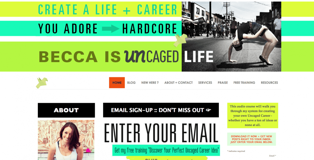
YEAR ONE: DIY
Money spent: $500ish
I started my site DIY and did it all myself, save for a logo design and someone to help me get the basic structure of the site up. Unfortunately the snapshots of this version didn’t capture in Wayback Machine, so you will have to believe me when I say that it was really basic. I did have some pops of bright color and some great copywriting which helped me define my brand right off the bat, but the site was definitely nothing to write home about (except for the very HUGE fact that I had a website. I was extremely proud of having created it myself, despite many tears and sleepless nights trying to get thing to line up properly and work well…including a 4 hour battle with trying to make my contact form yellow, because I thought it would look cool. What a waste of time!). I had this site for about 8months before I hired any help and made major changes.
Why this version needed to change:
- DIY hack job was apparent
- Too hard to style basic elements myself
- Embarrassed about sending people to my website
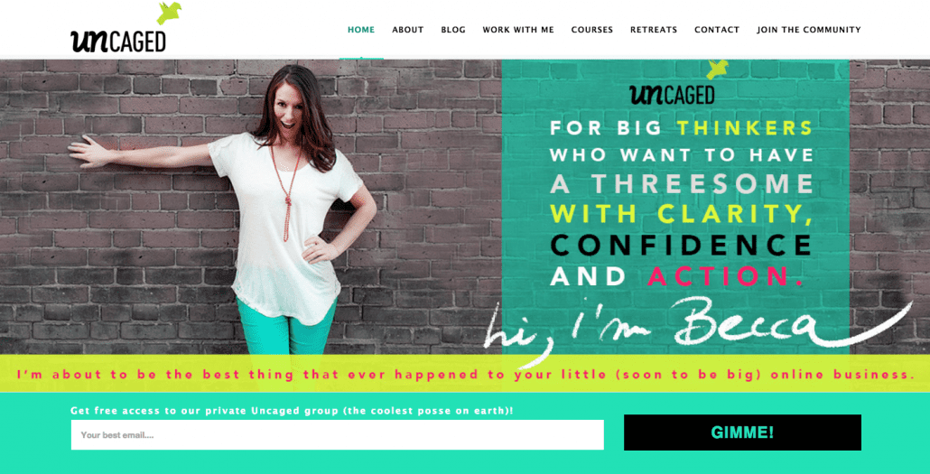
YEAR TWO: Header + sidebar design
Money spent to get this look: $1000
About 8 months into my business, I decided to pay for some help. I paid a web designer $1000 to help me and she designed a header, my opt-in, and some sidebar badges (this is similar to what you’d get if you did a Brandburst with us, except BB also includes a session with me and a tagline written for you).
This made a huge difference and even though, looking at it now, it’s SO busy, it was still a huge improvement over my old site and was well worth it. I finally felt legit and felt proud to share my site with new people I was meeting! That was a HUGE deal and worth it in and of itself to not be embarrassed about my website! But it was still not the fully functional and beautiful site that I wanted. I had to style the copy on all of my pages, and whenever I added new services or changed my opt-in, I had to do a hack job of adding new content and making it fit with the site. It made things look disjointed and unprofessional. but it was what I could afford at the time so I made it work. This iteration of my site was around for about a year.
Why this version needed to change:
- Too busy and bright
- Needed more consistent styling throughout entire site, not just on homepage
- More niched in business needed new copywriting and new taglines etc, and that needed to be better styled on the site
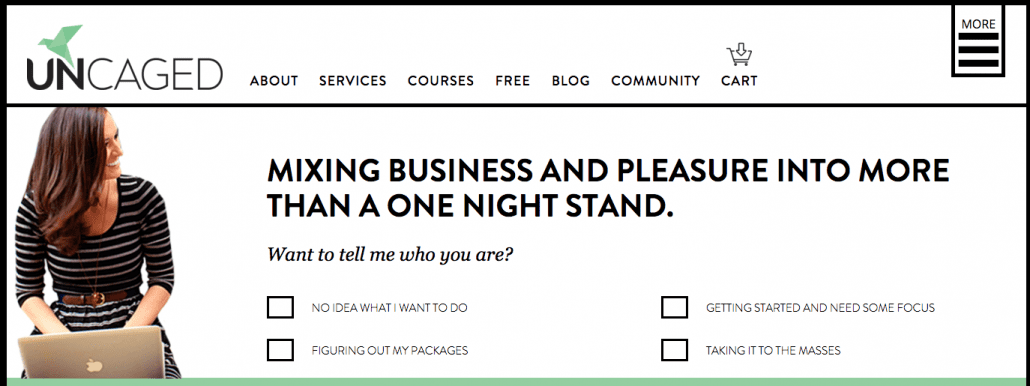
YEAR THREE: Semi-custom site
Money spent to get this look: $5000
At the very start of my third year, things were ramping up in my business and I knew it was time for an overhaul. It wasn’t so much the branding that needed to change, it was just the overall look of the site – it needed to be more pulled together and I needed some custom work done on my pages. I also needed all new copywriting. My business had evolved a lot over the first 2 years, and it was time to step it up and look the part online.
Basically, Uncaged need to grow up a little bit, while still being fun! And it did a GREAT job. Clients and readers raved about my site, and this website style (huge images, hand lettering etc) seemed to become a trend online (I’m in NO way suggesting that I started it! But I definitely got in near the start and then quickly started to tire of this style).
I loved my new site and it was definitely a huge upgrade for me. But still, this was only semi-custom work, which means that only 5-6 of my core pages were actually custom designed, so anytime I wanted to add new content or create new courses, I had to hack it together myself. The site also required a LOT of plugins for functionality because it wasn’t a custom site. And you know what happens with plugins? You get headaches and glitches and shit breaking. Not ideal, by a longshot.
**Interesting note about this site though – when I surveyed my audience and asked what they loved and didn’t love about my site, the majority said they loved it and couldn’t understand why I would change it. Of course, there were small things here and there that could be done better, they suggested, but overall they loved the look and feel of it.
So why on earth was I thinking about spending a small fortune to change it??
Because websites aren’t just about looking and feeling good. Websites are also about functionality and ease of use.
Especially in online business. And double especially for someone who wants to move towards selling more and more online courses.
So while my audience was telling me they loved my website, I knew that major changes needed to happen if I wanted my business to grow with me.
Why this version needed to change:
- Too hard to add my own content/new services/courses and make it look good without having to hire a designer each time
- Confusing for clients to find what they needed with courses/retreats/services all separated (they wanted to see it ALL together to choose their best option)
- Plugins conflicting with each other and causing problems
- WordPress updates causing problems with my theme
- Too difficult to navigate through old content on the blog – heaps of great stuff getting buried away
- Crappy user experience for buying courses and services – had to buy one at a time and be re-directed OFF my site to PayPal to buy. I knew I wanted to expand and sell more courses, and knew this would require integration of a shopping cart.
- Overall, it wasn’t great user experience. I think that because people are used to these kinds of sites, they didn’t really notice that it sucked – they just thought all websites were that way. But once you give them a GREAT use experience, that’s when they start to really notice and appreciate how easy it is to use
YEAR FOUR: FULL CUSTOM SITE
Money spent on this version: $12 000 + VA fees to help with all the integrations
You can see right off the bat that this site is SUPER engaging. You can click around without having to always use the ‘back’ button, you can see programs at a glance, you can poke around in the blog categories or see all the posts at once, and there is a shopping cart where you can buy multiple products and services at once without having to leave my site.
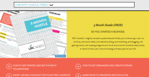
But most importantly, on the backend, it’s extremely easy for me to add new content.
To add new courses, I can go into my new “courses” tab in my dashboard and input all the content in pre-made forms, and it will automatically style it on the course page:
HOW IT LOOKS ON THE BACKEND:
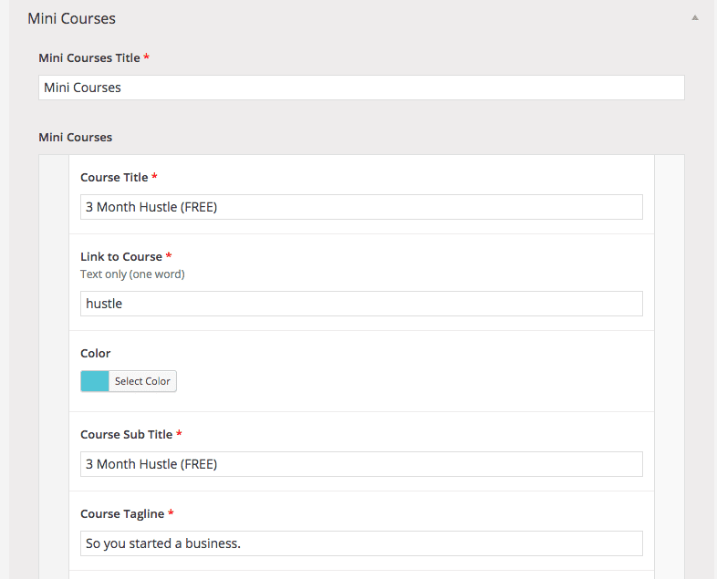
HOW IT LOOKS ON THE PAGE:
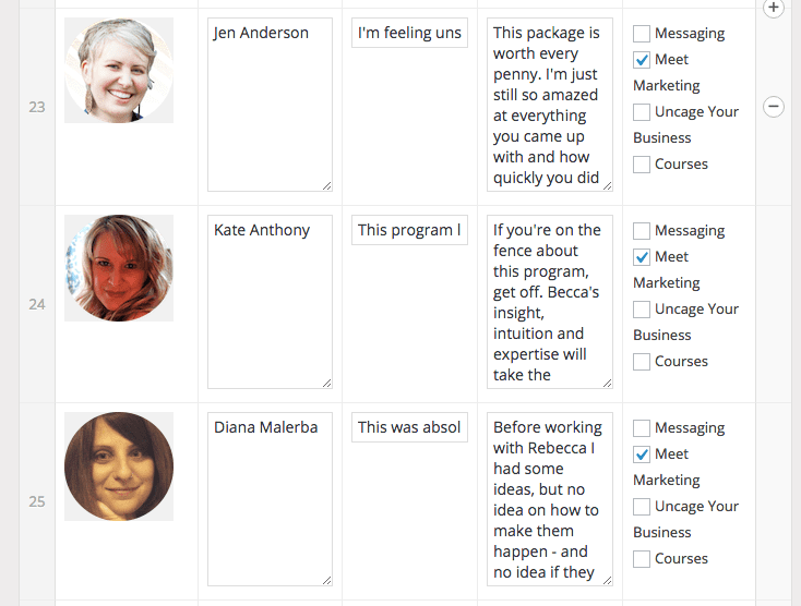
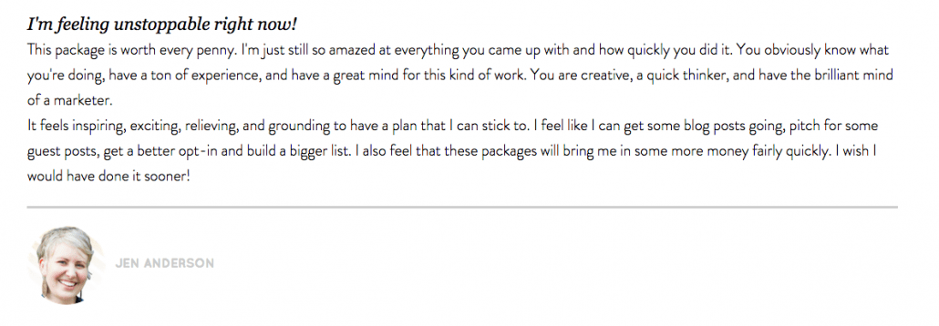
I can also add new testimonials to the testis section, and simply check the box on which page I want them to show up, and they will show up there, neatly styled and ready to help me sell:
HOW IT LOOKS ON THE BACK END:
HOW IT LOOKS ON THE PAGE:
And a multitude of other functionality that make it EASY for me to add to my website and business as I grow.
With the new launch, I’ve also integrated multiple opt-ins, which requires a more complex system than Mailchimp (which did GREAT up until now and I totally recommend them!). But now, I can easily add new opt-ins to my FREE page, take stuff away, and segment all my lists so that I can have tailored automation sequences for each one and make sure that I’m optimizing what I send and to whom. Not gonna lie – this shit stresses me out and it NOT my forté, but having a great VA on my team allows me to take care of this kind of thing without a huge headache.
This was HUGE investment for me – the biggest single investment I have made in my business to date. but as you can see, it didn’t happen right off the bat. I made small changes as I went, and let myself grow into this kind of change. And it was WELL worth it, but there is NO WAY I could have done this in my first or second year of business. Actually – let’s talk more about that.

STRUGGLING TO FIND YOUR NICHE?
GRAB MY FREE NICHING GUIDE HERE, AND SAY GOODBYE TO ALL YOUR NICHING WOES!

STRUGGLING TO FIND YOUR NICHE?
GRAB MY FREE NICHING GUIDE HERE, AND SAY GOODBYE TO ALL YOUR NICHING WOES!
What I did BEFORE I re-designed:
First off, before you invest in anything, you want to make sure that you are clear about your business foundations – your niche, your message, your services and packages etc.
At this point in my business, that stuff is super crystal clear. This re-design was more about functionality than it was about change in niche or anything like that.
I had an idea based on market research and my own assumptions about which elements of my site needed changing, but I wasn’t about to invest over $10k on a whim. Even though my clients were TELLING me my site was great and just needed a few small changes to make things more clear, I wanted to make sure I was making an informed decision and not just going about this thing all willy nilly. I needed some real data to make my decisions. So I hired a web designer/developer/data geek to help me geek out on all things analytics. I have NO idea how to read my own Google Analytics beyond the basics, and I knew investing a few hundred dollars to see the full story would be well worth it.
Don’t just assume that you know how people are using your website. Track that shit so you can make informed decisions.
She looked at not only my Google Analytics, but also my Session Cams and heat maps (best tools EVER by the way and SO easy to read compared to GA) to help me get a better understanding of how far people were reading and scrolling. One of my biggest concerns was that my site was VERY copy heavy, and even though my copy is awesome, I wasn’t so sure people were actually reading it all! I wanted to cut it ALL down and keep it super short and to the point.
But what we found in my audit was that people were scrolling past the homepage, but reading EVERY SINGLE DAMN WORD of the About page. Huh. Who woulda thought!? I guess if someone is hiring a service provider, they want to get a good sense of who this person is. So based on that we decided to keep the long about page, but ALSO add a short and sweet version for anyone who just wanted the gist.
We also made all kinds of decisions about which pages needed better opt-ins, which blog posts to delete, which programs were getting the most views and from where, and which functionality would make the most sense to integrate into the new site.
NONE of this would have ever been mentioned by clients in market research, so it just goes to show that just because your site looks pretty and people “like it”, it doesn’t mean it’s working well for you or your business. If you’re going to invest in new design, it’s absolutely crucial to do it from an educated place. My last site looked nice. My new site actually WORKS for me and my clients.
The Process
The entire process of this project took about 7 months. I started conversations with my amazing designer, Lis, back in April, and we set a start date of mid-June. She worked behind the scenes on the site during the majority of the time, while my VA sources out new systems for us for our mailing lists (Active Campaign) and shopping cart (Easy Digital Downloads), while I got busy creating all the new mini courses.
We pushed back our launch date twice, because this shit ALWAYS takes longer than you think it will! And then my team worked their asses off to make sure everything was working properly when we were ready to go live. I feel EXTREMELY grateful to these women, because without them I’d have to do this al myself and I’d surely have ended up pulling all-nighters with a LOT of tears, and that’s just not worth it to me. I’d rather pay someone else to do the heavy lifting, even if it feels scary investing THAT much money. #alwaysworthit
We still have things to figure out now that the new site is up – links are going missing, emails seem to disappear, some of the buttons are funky, and there is still some upkeep to do behind the scenes.
When to re-design/re-brand:
What’s the difference?
First let’s get clear on the definition, because I see this being thrown around ALL the time. What I did at Uncaged was NOT a re-brand. It was just a website redesign. A re-brand would be if I was to completely change my message, my viewpoints, maybe my audience, my marketing strategy, to represent something very different than what I do now. It would be like if I decided to take away the edgy, playful, no BS approach at Uncaged, and instead use a softer, subtler, more intuitive tone. I’d change phrases like “business doesn’t have to be a shitshow” to something like “using your inner guidance to help your business be a true representation of your beauty” — or something like that.
A solopreneur business might decide to rebrand so that they can show more of the true THEM in their business if what they started with was something watered down or not authentic, or they might decide to start working with a different market and need to uplevel their brand to match their new audience (and prices).
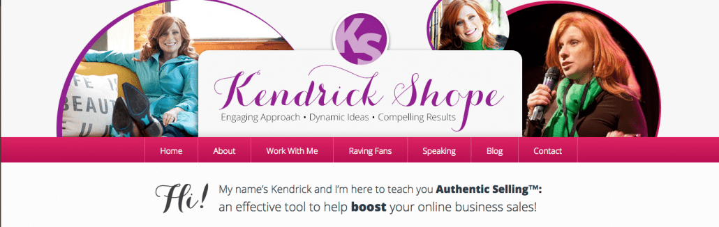
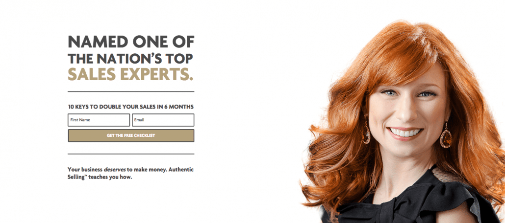
Kendrick Shope is a GREAT example of someone who rebranded, not just redesigned. Kendrick is a powerhouse and means business – her clients get real results and pay her top dollar for it. But her old brand didn’t really have that strong, powerful, professional feel to it. Her new one? Definitely does.
BEFORE:
AFTER:
You definitely don’t want to redesign or rebrand too often though – People will be confused about what the hell you’re actually doing, and if you find the need to do it THAT often you probably need to take a few steps back in your business and get back to your foundations.
How to know when to invest in your website
If you’re just getting started, there is NO WAY you should invest such a huge amount of money. It’s just not worth it. Your business will change and grow tremendously in the first 1-2 years, and if you do a full blown site right away, you will inevitably have to make major changes soon down the road. It’s absolutely fine to pay just a little bit and do what you can yourself, and allow your business to grow into itself before you fork over the big bucks. As you can see in my examples above, the evolution of my website happened naturally and now, 4 years in, I’m very clear what my business model is, and thus what kind of website I need to support it. You simply can’t know that when you are just getting started unless you have been doing what you do for a while behind the scenes.
Along the way, if you feel like you are outgrowing your current site, and the frustration and time it is taking you to add new content is more headache than it’s worth, or if you have clients telling you that your site is confusing or hard to navigate, it’s a good sign you’re ready to up-level. Also, if you’re so embarrassed about your site that you never tell ANYONE about it – it’s well worth it to invest a little bit to get it to a point where you are proud to show it off!
Ditto if you are making enough money that $5k or $10k doesn’t make you want to cry – do it.
If you feel like you need to invest because “nothing is working and no one is buying”, I’d hold up a sec and take a look at what else might be going on in your business.
- Are you clear on your foundations?
- Do your people actually want what you are selling?
- Are you marketing yourself effectively and getting in front of enough people?
There are a lot of reasons businesses don’t work, and you don’t want to rush right into re-doing your website unless you KNOW that is what is holding you back.
Do you need to “launch” when you re-design?
I didn’t… at least, not really. I did host a launch party and gave away a bunch of courses, but I didn’t make a HUGE deal out of the launch. This is a personal decision and you could go either way – you could ramp things up to sell a bunch of your new services/products if you have re-created them all.. or you could just quietly create the new site and delight your users the next time they come around. My goal wasn’t really to sell anything new, as all my services stayed the same, but since I did create some great new mini-courses I wanted people to check them out, hence the launch party contest. You absolutely do NOT need to give yourself a headache about “launching” an updated site, if you don’t want to.
Phew. That was a LOT of info, but I hope it helped you get a better idea of when and why you should re-launch. I absolutely don’t think you need to have a full-on custom site right out of the gates, but you do need something that looks good and gives your business a home you can be proud of. I’m more than happy to answer any other questions you have about redesigning – shoot them into the comments and I’ll do my best to help!
![]()
PS. Uncage Your Business is opening for November this week! Click here to get on the list be the first to know and get access to exclusive early bird bonuses.

Love it becca! Appreciate your honesty & amazing advice!
Can I ask who you used to track your GA’s?